Developing a unique identity for a uniquely positioned British bank.
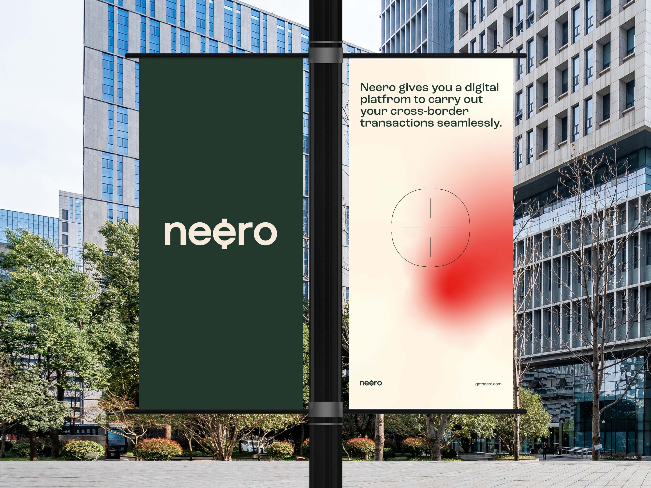
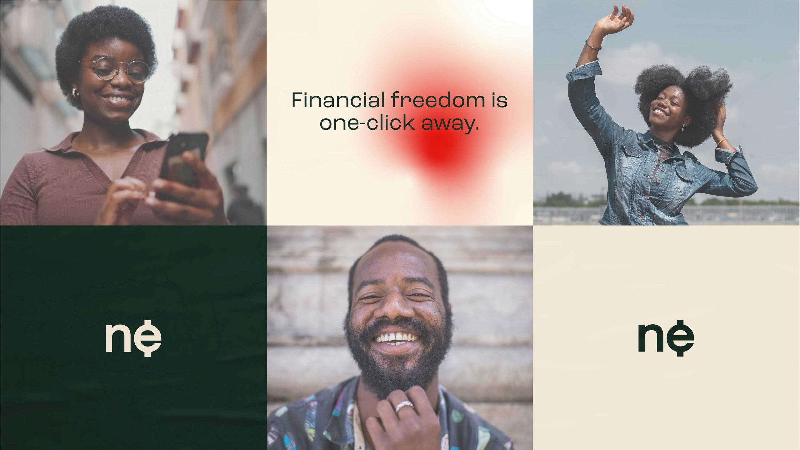
Neero is an african-owned bank in Britain. The brand was birthed to cater to a gap in the British financial system. The current financial system in Britain makes it difficult to perform cross-border transactions with Africa. Neero is on a mission to to bridge that gap. Sending money from Britain to Africa and vice versa will become much easier and seamless.
A new player on the block
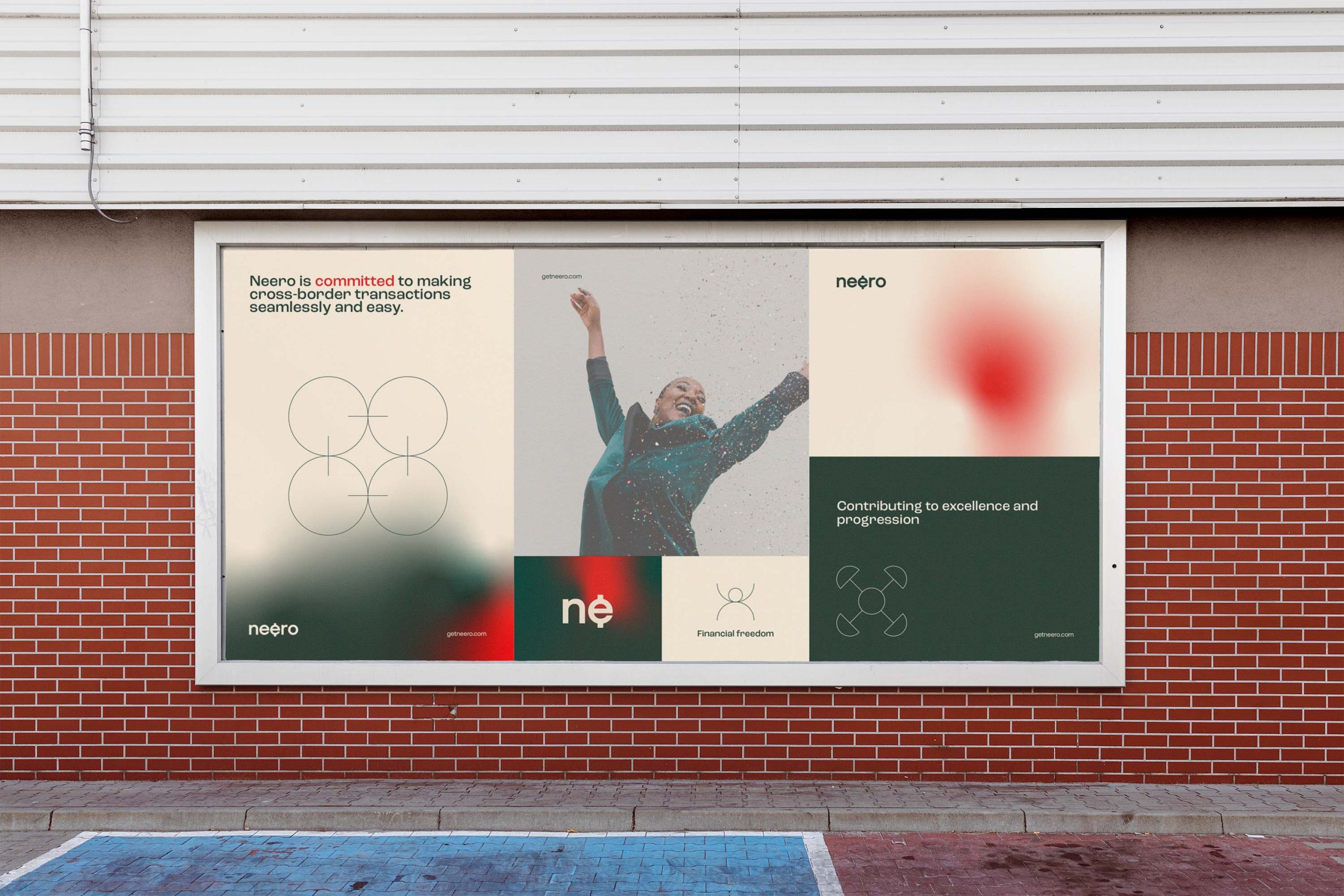
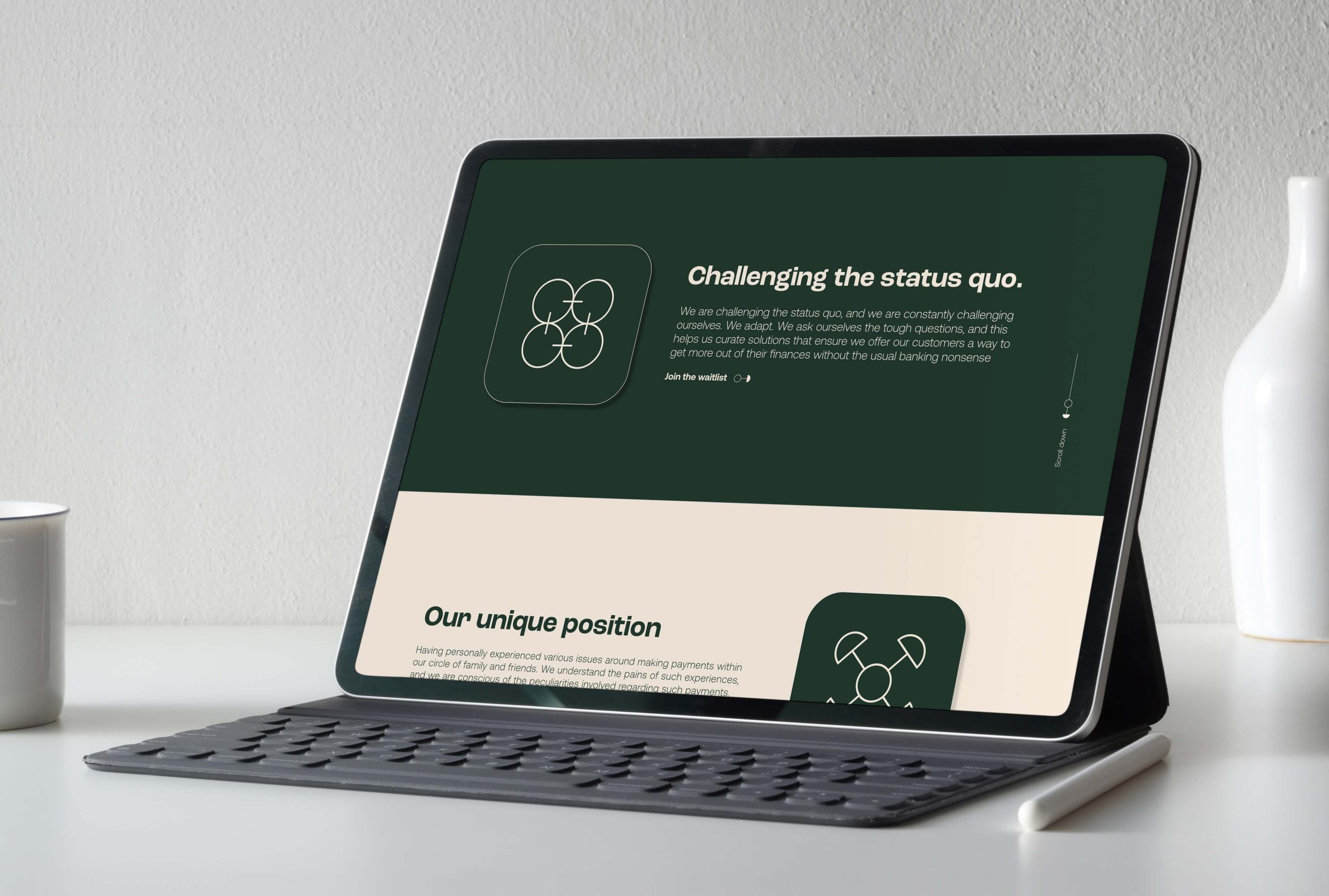
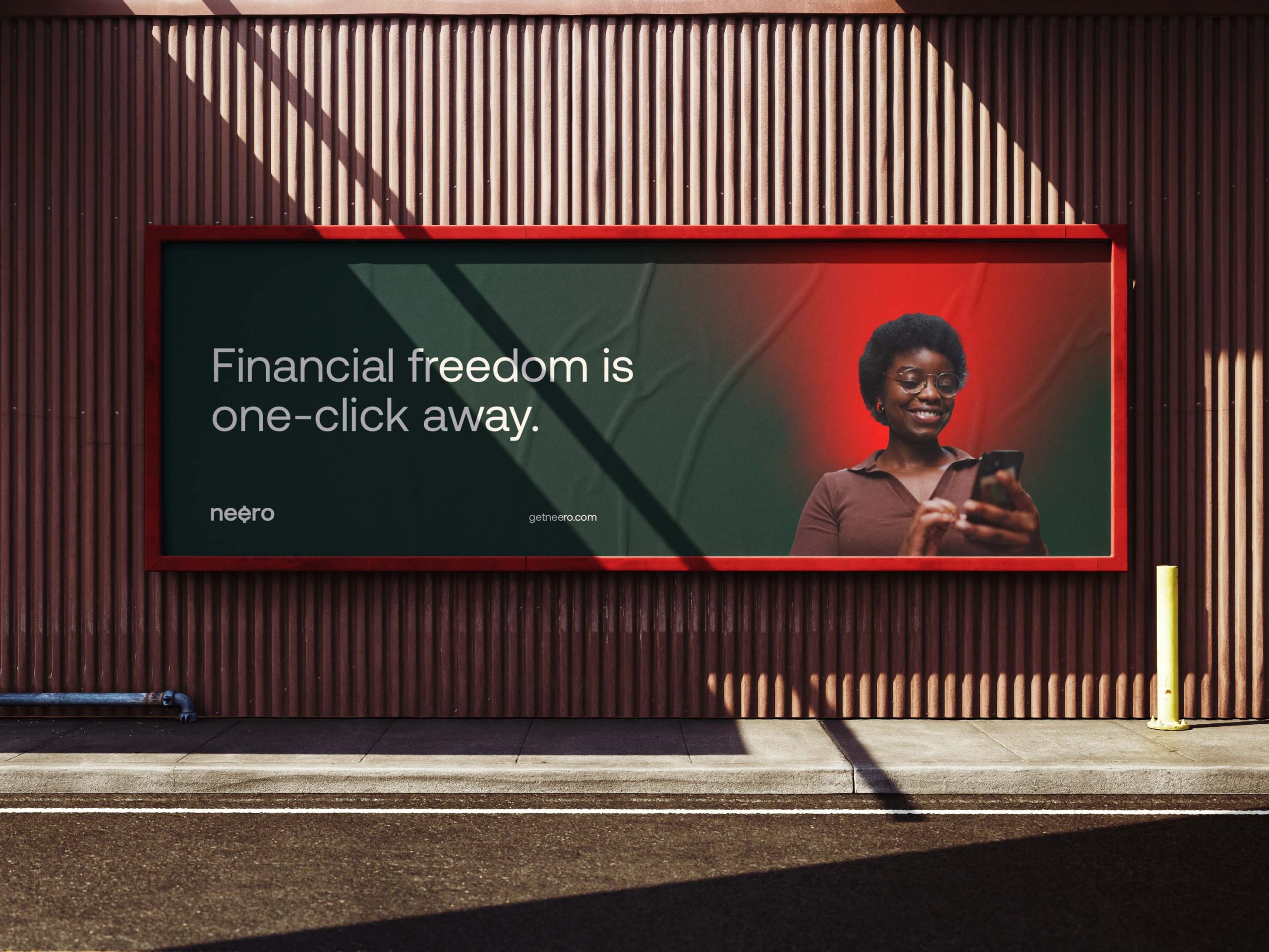
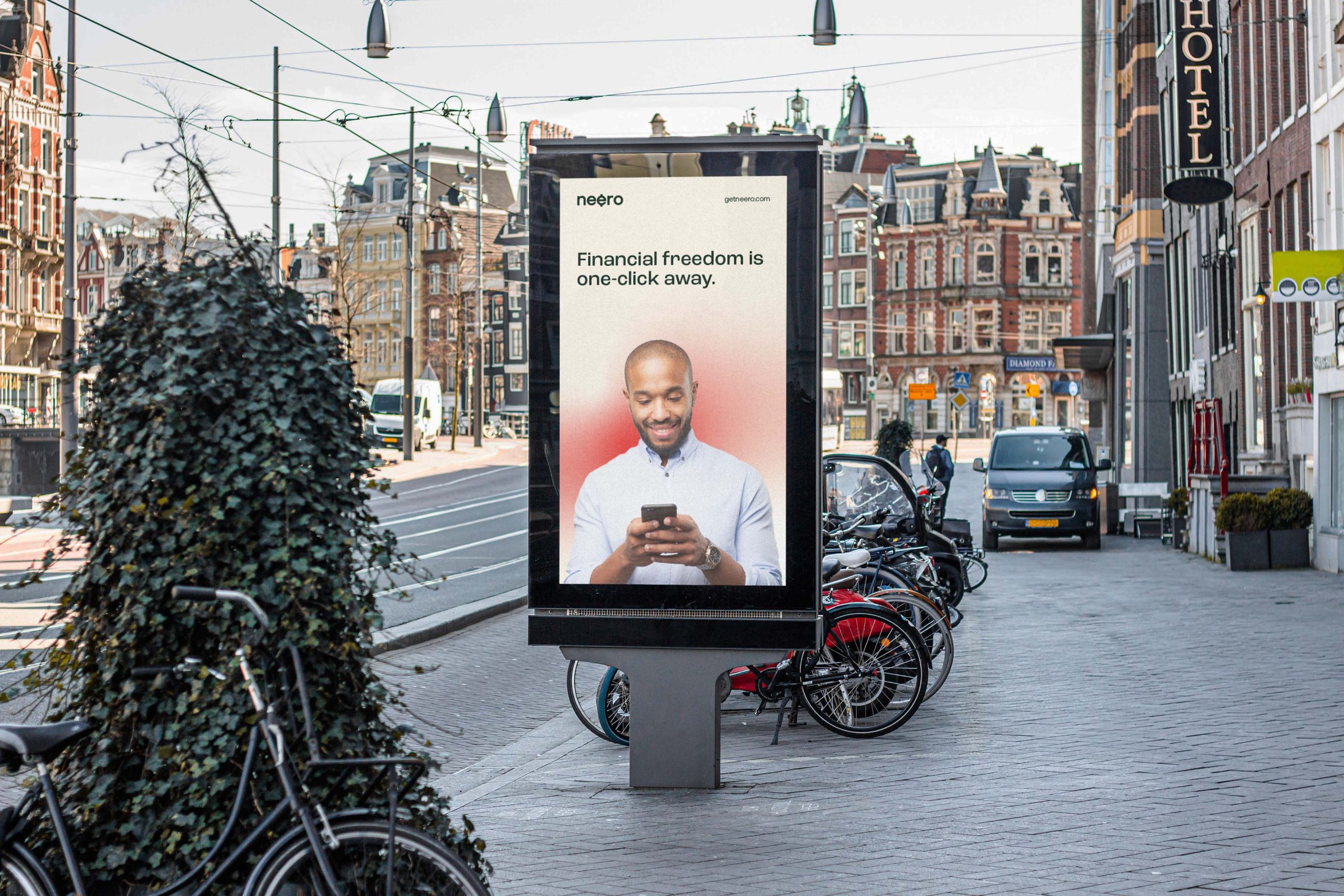
The financial industry in the UK, and world-wide for the most part is somewhat conservative and corporate. Neero is occupying a unique position and therefore deserve a unique identifier. We crafted an identity system that is a bit more expressive than the average financial institution while preserving the professional feel about the brand.
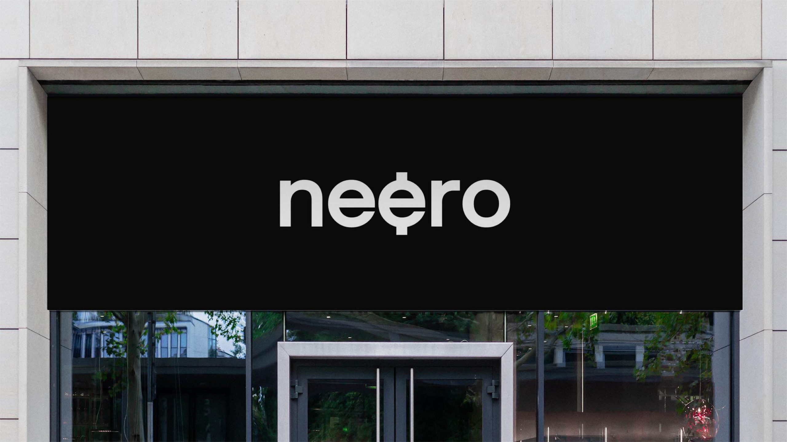
The identifier: Capturing the essence of money
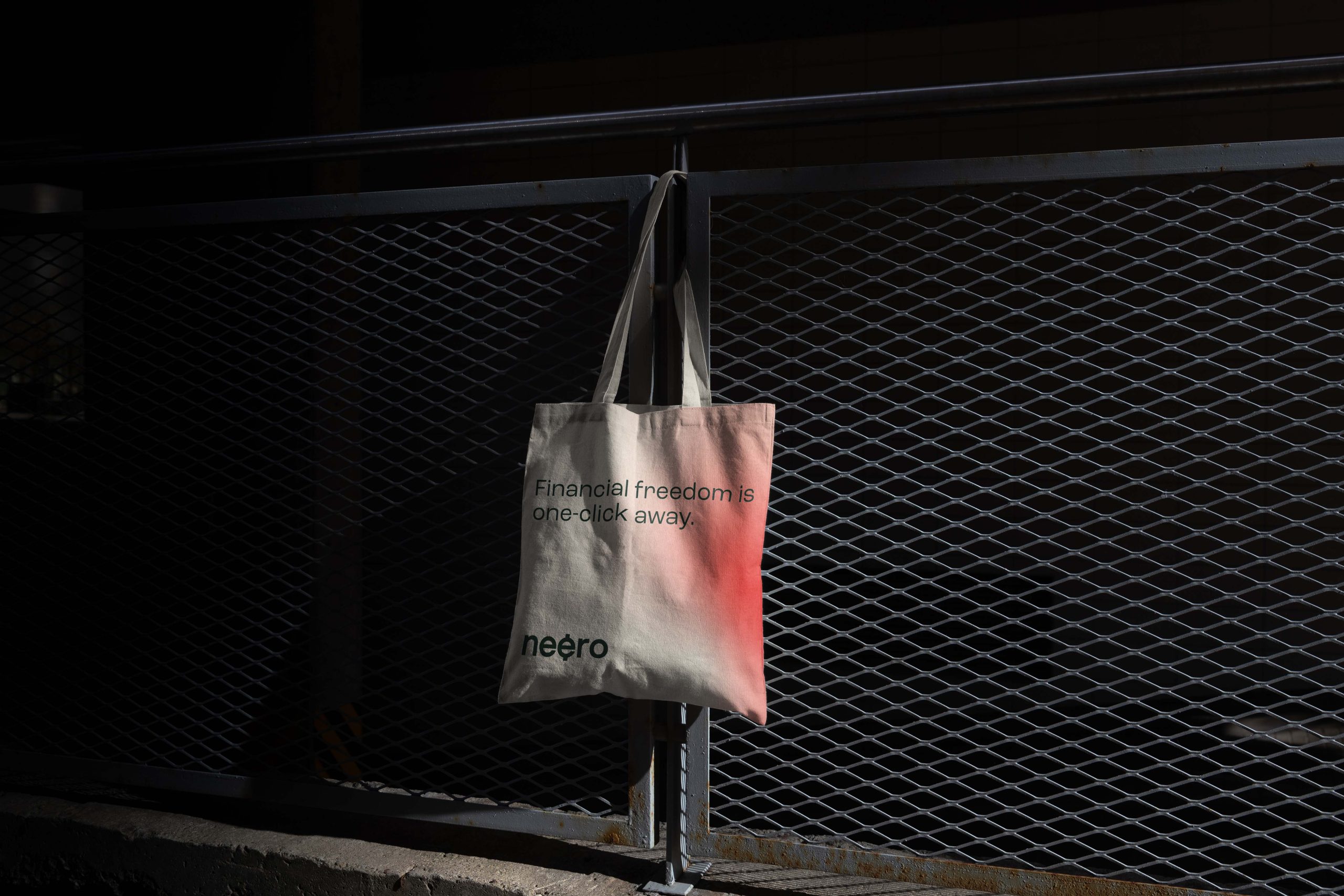
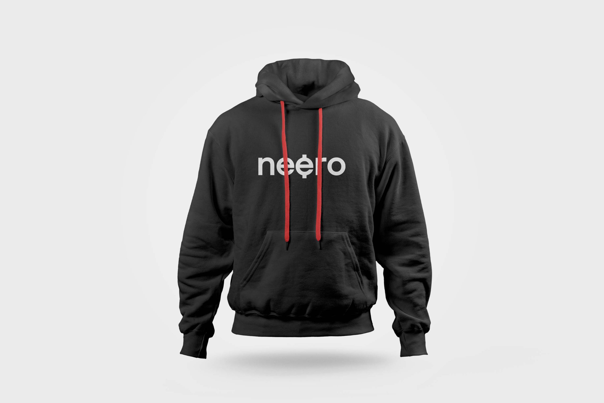
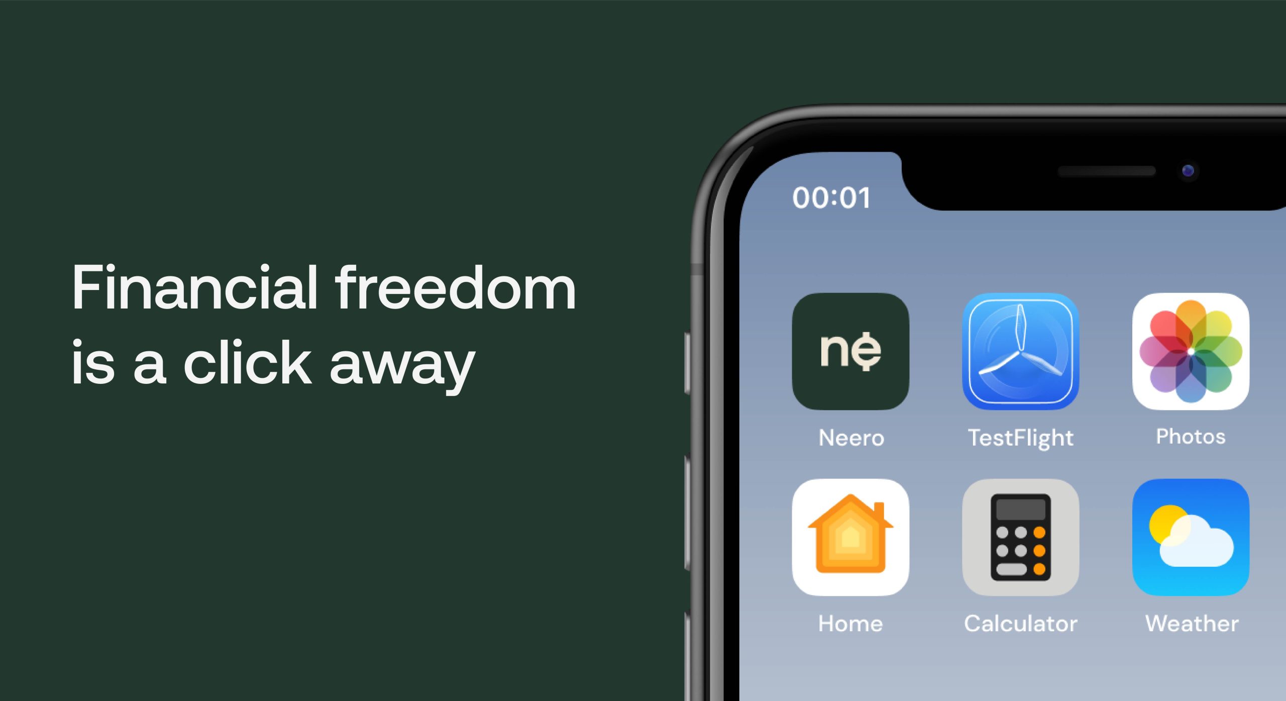
The logo was designed to give visual cues. It’s an icon designed to look like a currency. The idea was rooted in the challenge that birthed the brand, the difficulty in sending money across borders. We made the logo simple and easy to recognize.
Glyphs: The brand DNA rooted in the African spirit
We created glyphs that represents the different values of the brand. The glyphs were inspired by ancient African symbols.
Communicating value: The right words
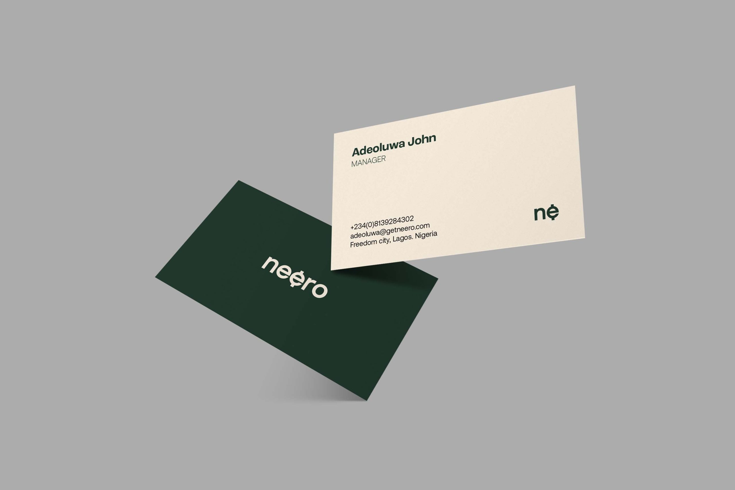
We paired Ubuntu bold, a unique sans-serif font with Oxygen another visually appealing sans serif font. We found this combination to work well with the visual aesthetic of the brand
.gif)