Creating a sophisticated brand experience for a luxurious liquor store.
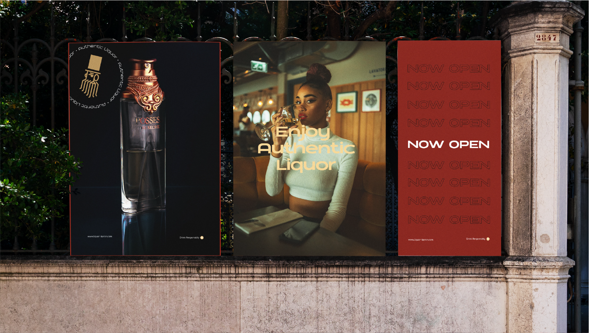
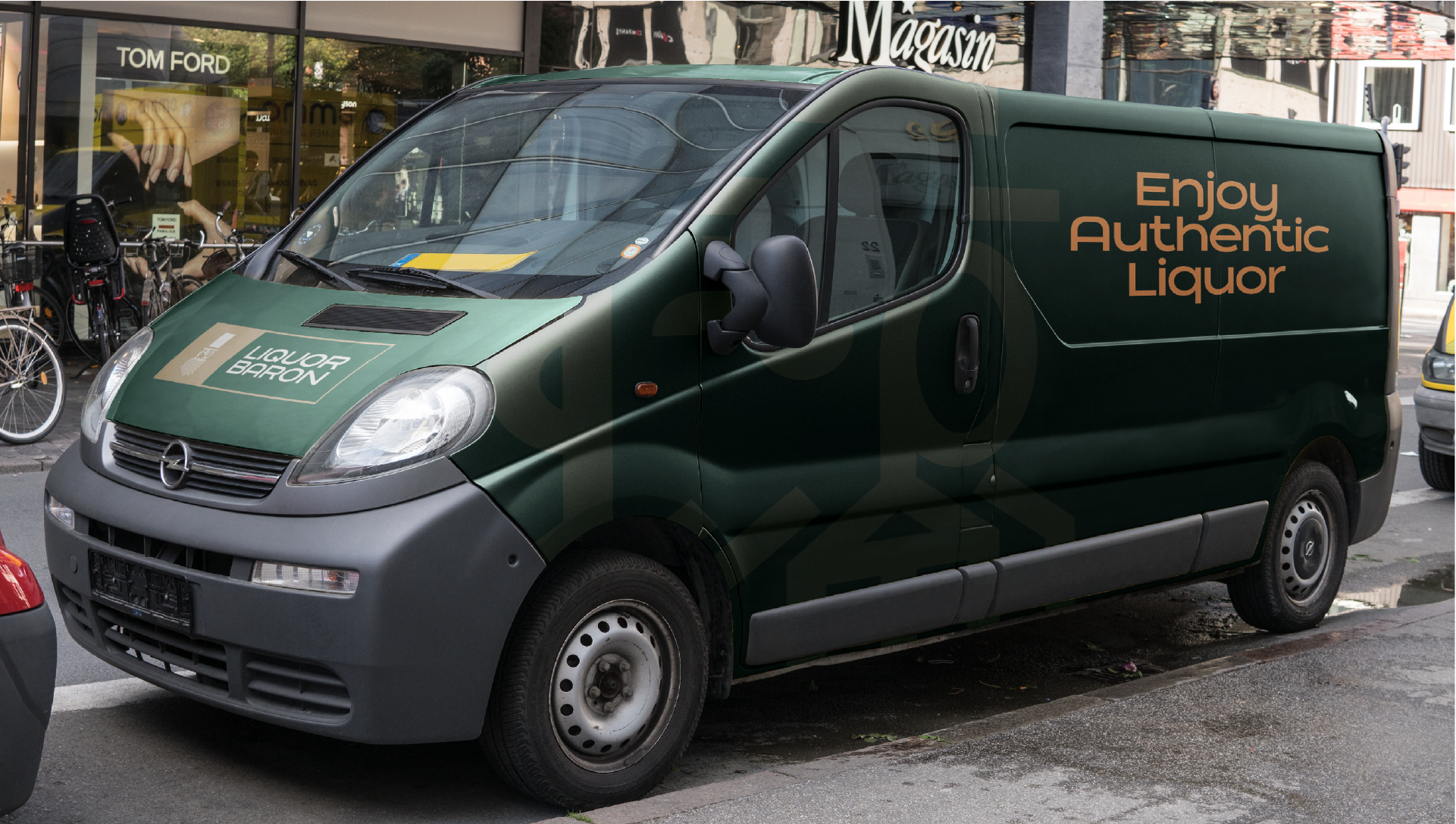
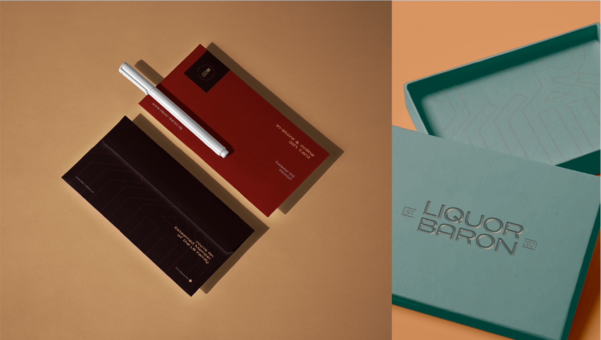
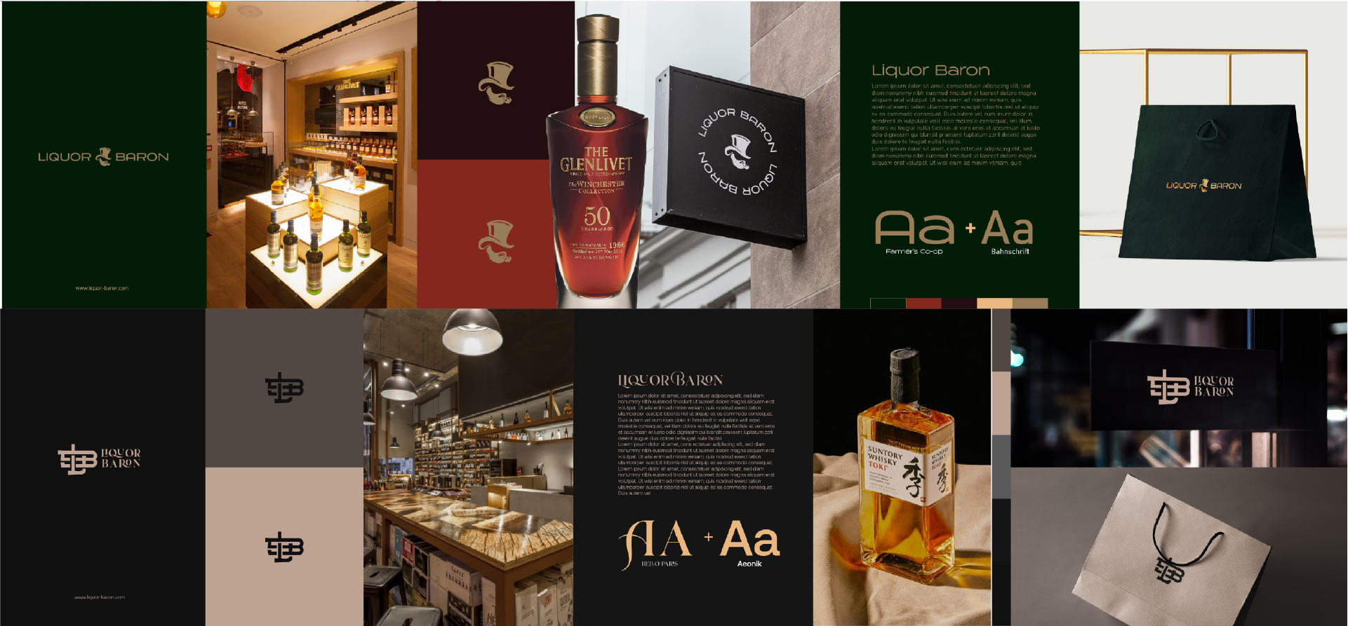
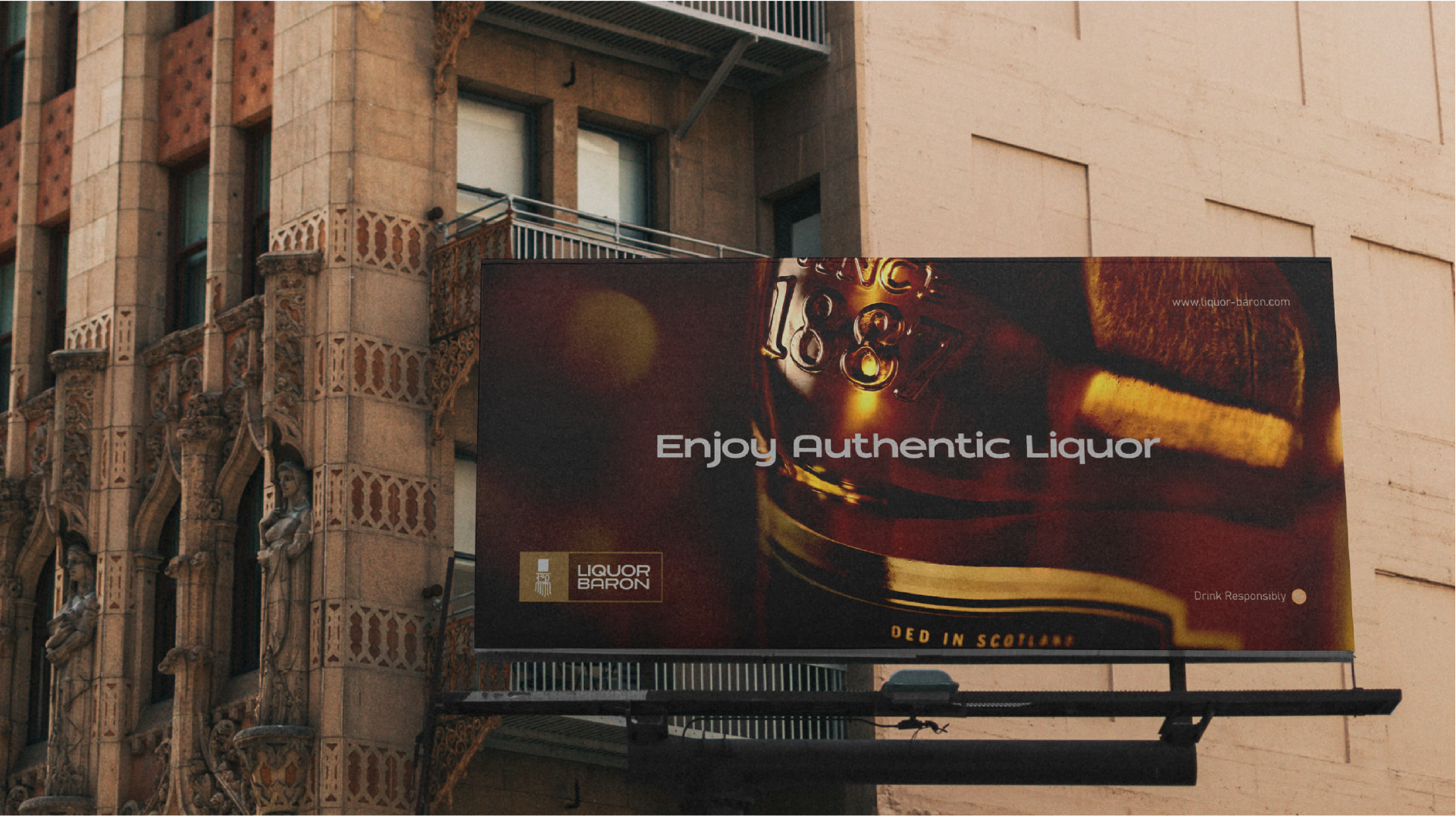
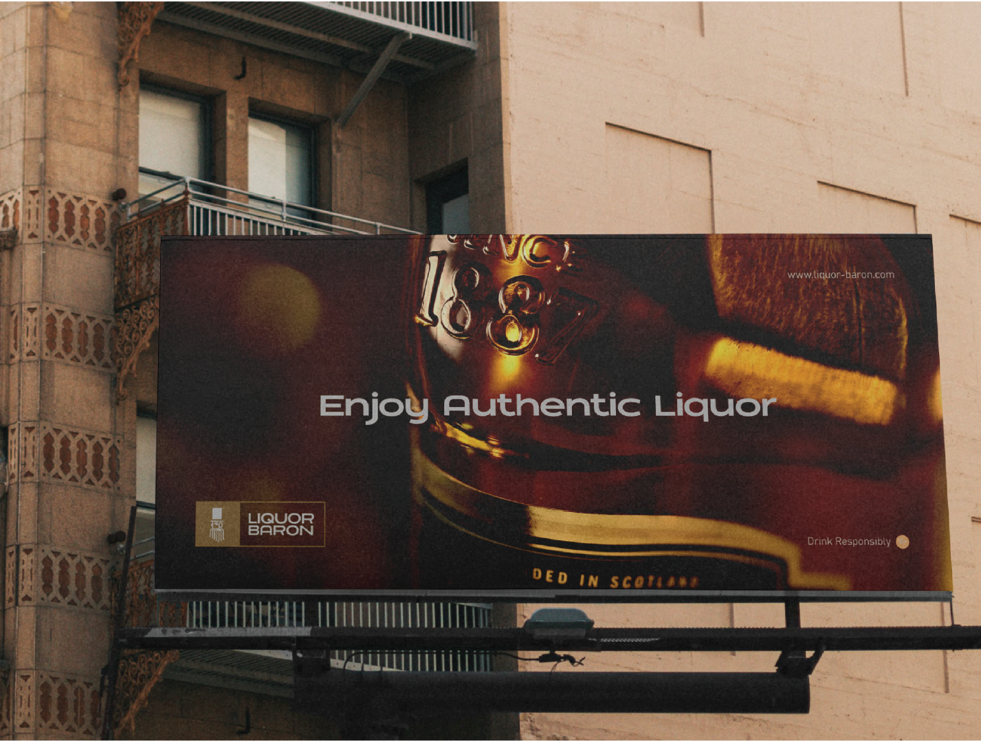
Authentic liquor supply, packaged in a unique, luxurious experience. This was the vision for Liquor Baron. In a market that is flooded with counterfeits, Liquor Baron promises to supply only authentic products. We helped them to bring this vision to life by creating a sophisticated brand experience and a unique brand positioning.
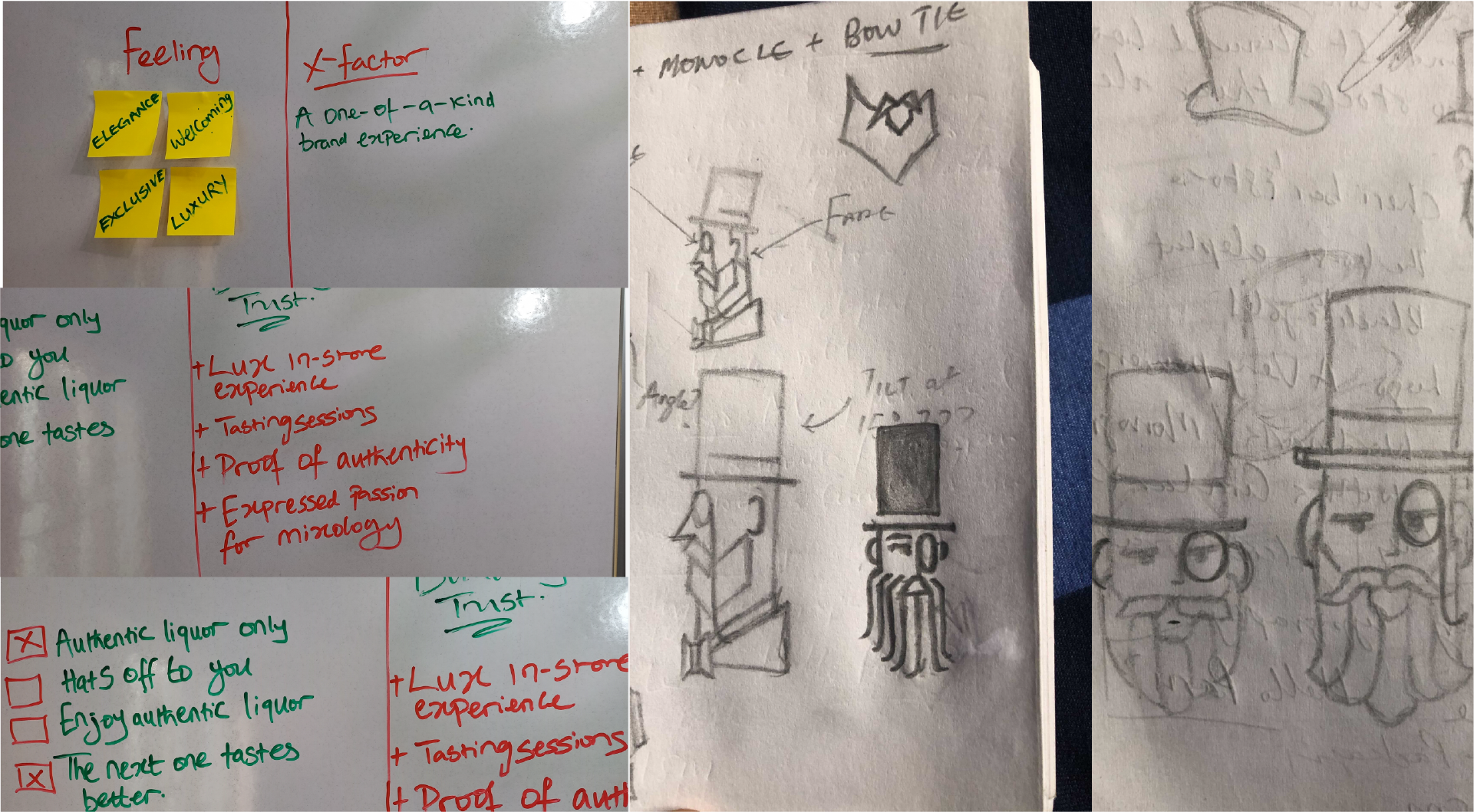
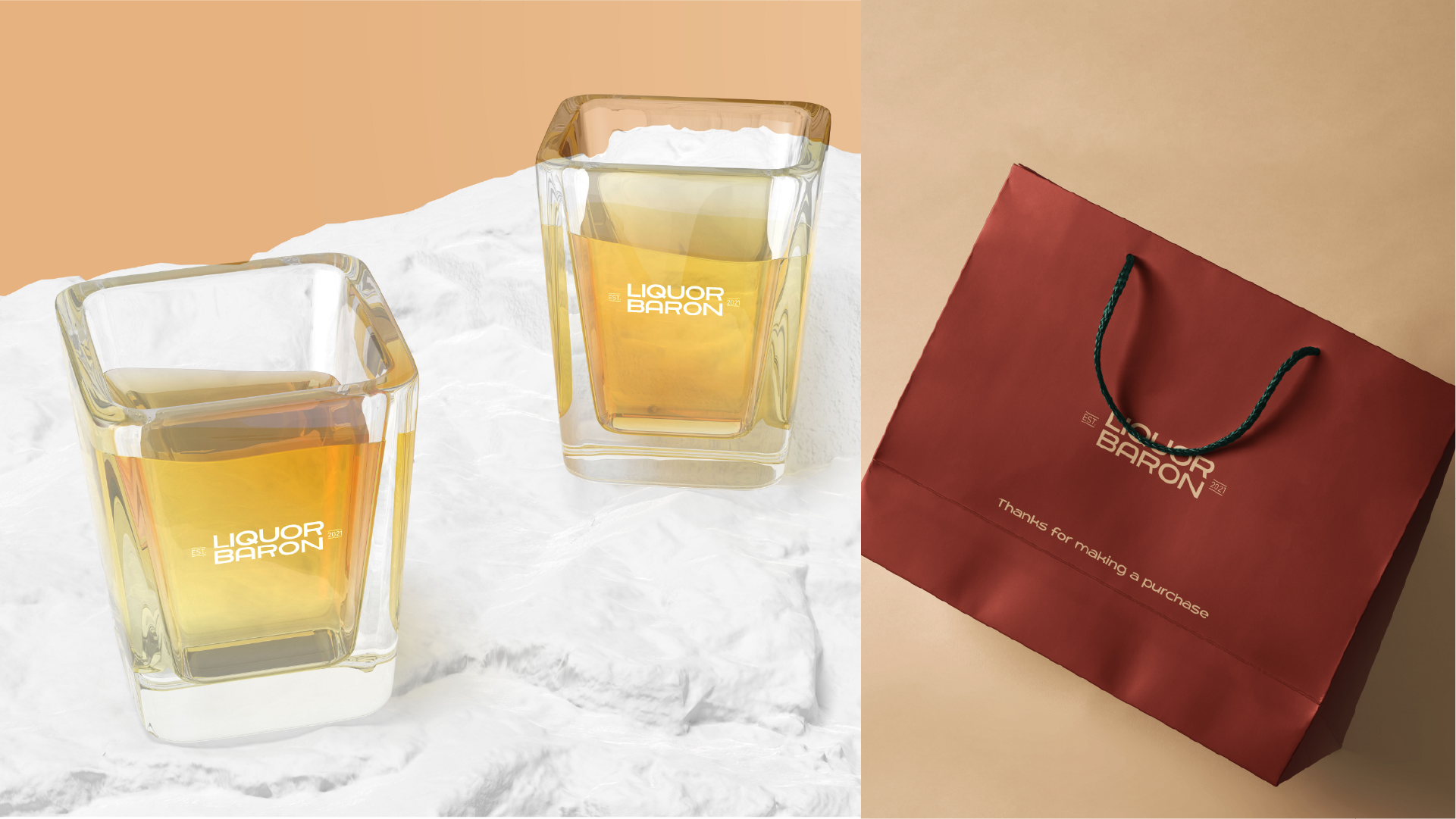
Luxurious, not snobbish
We were tasked to create a luxury brand, but we had to ensure that we weren’t turning people away from the brand. We worked to create a brand that is warm and welcoming while maintaining the luxurious feel. This was our frame of mind in creating the visual expression for the brand.
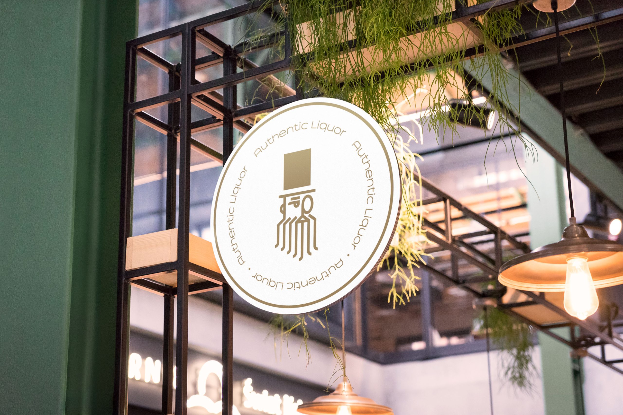
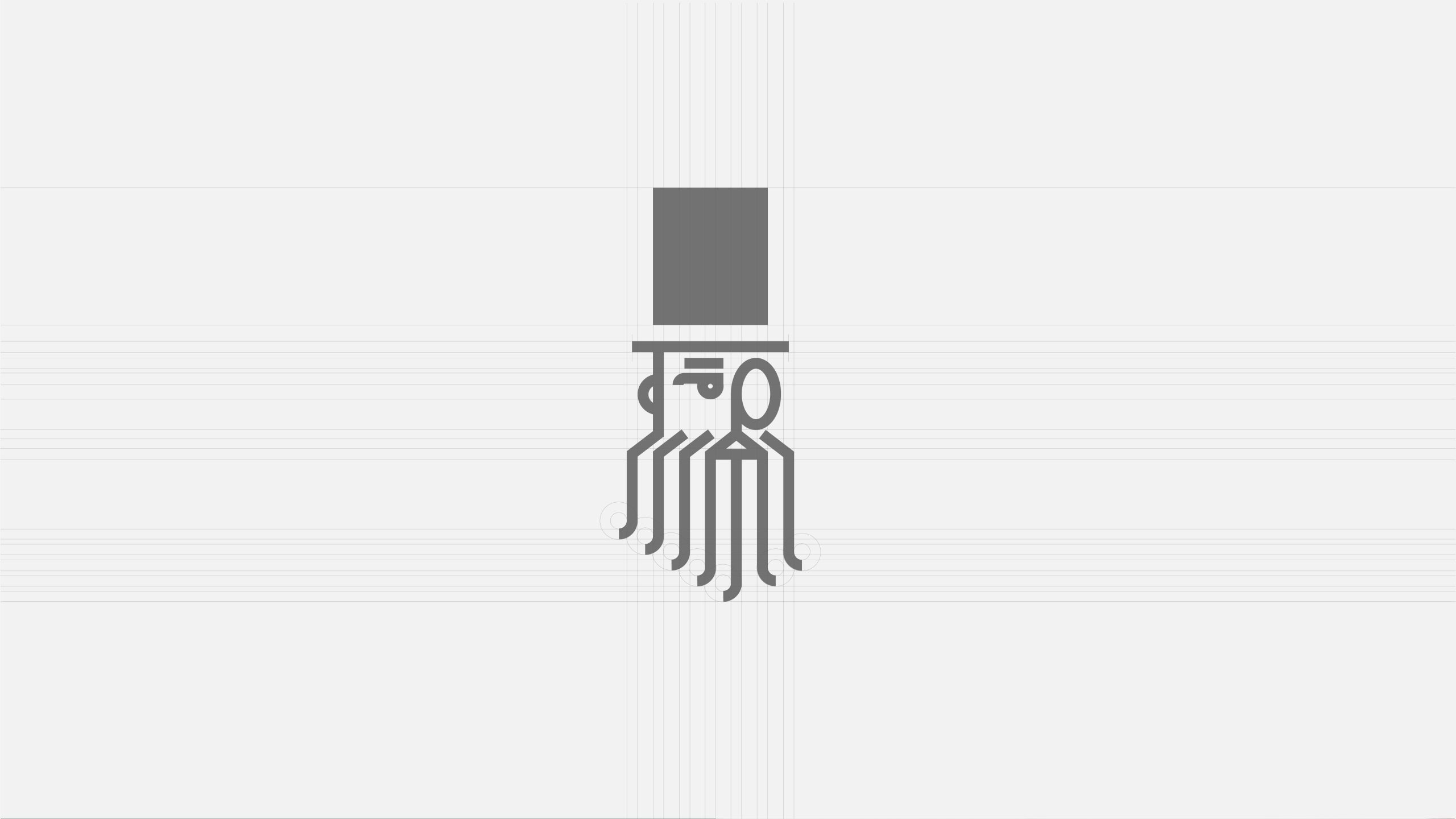
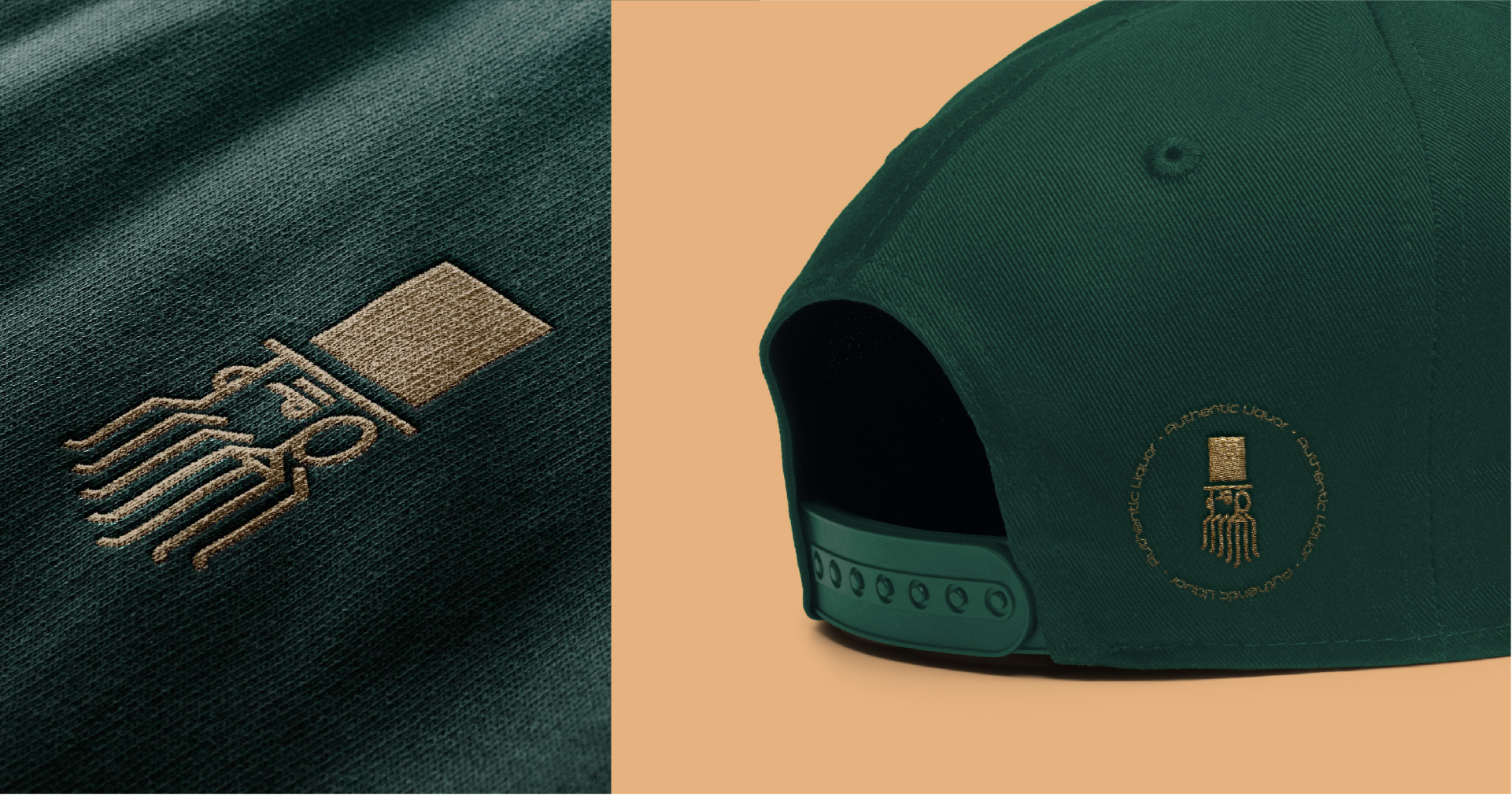
Meet the don. He’s one for the culture
The don was carefully created to exude a strong presence and classic feel. The illustration is a direct iteration of the word ‘Baron’ in the brand name. The mark was majorly constructed with geometric shapes and brought together with the curves of the don’s beard.
A way with words
Farmer’s Co-op is an extended bold sans serif font with a strong presence. It was inspired by a hand painted, sign up top a local Farmer’s Co Operative in Springville, USA. Paired with Bahnschrift the typographic system achieves impactful messaging and an efficient brand expression.
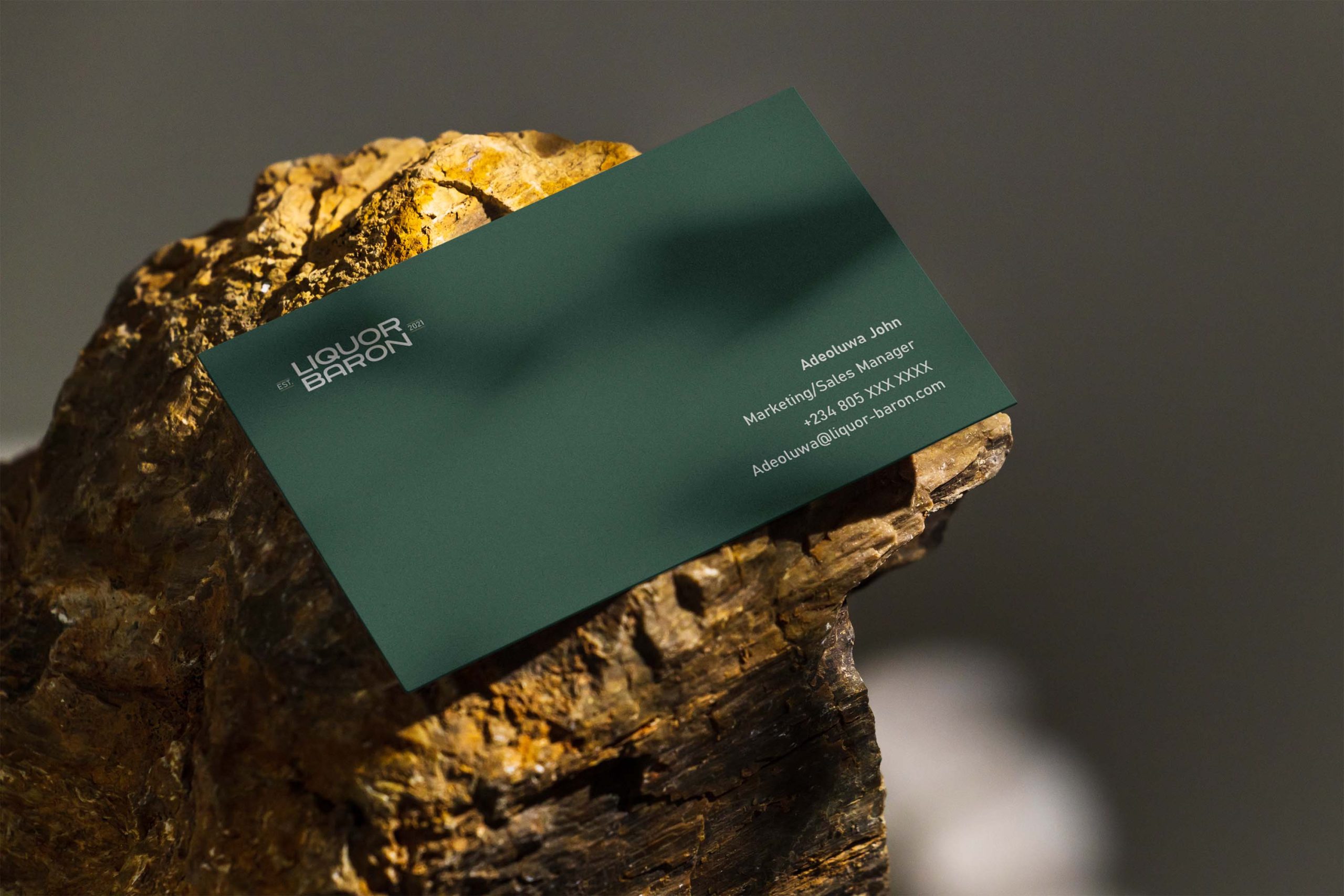
Communicating luxury: A verbal identity
Communication is only as impactful as it makes the audience feel. We developed a tone of voice that exudes confidence and when infused with the visual expression of the brand, comes across to the audience as a brand that can be trusted. An authentic luxury brand.

.gif)

%20(1)%20(1)%20(1).gif)